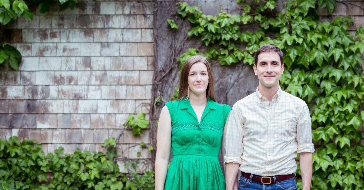
WHO: Micah Whitson (a.k.a. The Old Try)
WHAT: Designer - Letterpress, Lino-cut, Graphic Design
WHERE: Boston, MA (by way of Alabama, Mississippi, and North Carolina)
Why a career in design?
I find beauty in form. And in communication. Even before I got into design, I thought I could be at least better than the bottom 10% of designers out there. So I'd always have a job.
Why letterpress?
Letterpress is just the form we've chosen based on what was available. I grew up looking at rodeo posters from Hatch. They were informative and hearty and bright and clear. Our printer here has drawers full of old display type, just like Hatch did for those rodeo prints. So we thought this would be a good way to get our message out there. Since each letter has been around for +/- hundred years, they've got dings and chips and scratches. They've printed up signs for parades and for union strikes and for shindigs at dance halls. There's a lot of living in those letters and we hope to continue to give them life.
(see the process)
What does 'good design' mean to you?
Clarity. Simplicity. When there's nothing left to take away, that's good.
"Nobody can see your vision until you show it."
Who are your influences?
When I was much younger, Transworld Snowboarding magazine. Now most inspiration comes from old state archives and yearbooks online.
What's the best piece of advice you ever received?
Everything is an opportunity until it isn't.
What's your best advice for aspiring designers?
Nobody can see your vision until you show it, and you can't show it until you've wrestled it to the ground. You've got to put in the hours.
The words and phrases you print mean something to someone. From school cheers to Bible verses to literary references; how does design add to that sense of identity or belonging and make it more than just words on a page?
I try to get out of the way. I want to print words, as few and as simple as I can, and let them do the work of connecting a person to a memory. We do just print words on a page. We just work hard to find the right ones.
Your latest artistic endeavor was a proposed redesign of the Mississippi State flag. Even the chance to design a new State flag is rare. The flag Mississippi (thankfully) just did away with had been around since 1894.
Out of well over 2,000 entries, your 'Great River Flag' made it to the final two, but came up just short. Why did you choose to give a new Mississippi flag the 'old try'?
It is a rare occurrence for a designer where life experience (knowing Mississippi as an insider and an outsider) aligns with a life’s trade (a design portfolio based on typography and a decade-long art project based on connection to place), which aligns with the ability to perform a civic duty. For free.
With little time and 2,976,000 clients, I knew I was called for just that kind of time.

How has your work at 'The Old Try' influenced your understanding that a flag is more than just a flag?
A flag will be defined by those people who live underneath it and beside it and will give it heart and soul. Most flags have decades of definition given to them. This one hasn't flown but a day.
Have you allowed yourself to dream up a fully fleshed-out 'style guide' for your flag design?
Yes. I built out a whole site (https://greatriverflag.com/) exploring it. It was an opportunity until it wasn't.


The statue of Silent Sam came down at UNC Chapel Hill. Buildings at many southern schools are being renamed. Mississippi is changing their State flag. 'Good Trouble' is leading to good change. What does that mean for OLD TRY?
As I continue to explore what is it to be a Southerner, and how to display that in a house, I'll continue to push up against themes and ideas that feel right until they don't.
We've had some prints that have sold well over the years, but have started to feel tone-deaf or visually just off. So we've pulled them and drawn up news ones in their place. This life is too short to make work that divides. The time is short, let's spend it learning and changing for the better of us all.
VISIT THE OLD TRY


